The New Macbook Air and My Alternative

I was actively avoiding watching the “Back to the Mac” event that happened recently, because I usually end up being non-productive when it is going around.  Apparently that was a good thing, because the event was super long and was boring for me until the end part.  I’m not interested in the Lion stuff because I don’t run OS X anymore - and I didn’t run it even when my MacBook was working.  At the end there was some new hardware though, which was very interesting to me.
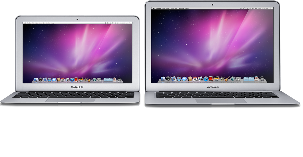
New Macbook Air line is very interesting because usually Apple has excellent build quality.  On the face of it, they are netbooks which are built by Apple.  11 inches and 13 inches, with a SSD hard drive but otherwise normal hardware for a netbook of that size, including a Core 2 Duo processor.  Camera and USB ports, but as a trusty netbook it has no DVD drive, and only USB ports.  They are super light, starting at 2.3 lbs.  These are all great things, but they are basic things that you would get in any mid-range netbook.  Unibody design is a little less common, most of the netbooks are made of plastic now.

It’s not all rainbows and lollypops though.  The battery is sealed in the compartment, not user replacable.  This might not be such a downside nowadays, since most users won’t be replacing the battery anyway and the previous iteration of Apple laptops didn’t have replacable batteries either.  It’s still nice to have the option though, and all of the other netbook manufacturers seem to have figured out how to make the removable battery work.  Also, because the SSD isn’t in the shape of a normal hard drive (in order to save space, Apple says), you can’t replace it with something larger on a whim, but you will need to purchase special parts which will of course be more expensive than the normal SSD cost when the price goes down (and it is heading down in that direction quickly).  Then of course there is the Apple tax on hardware, meaning that you will pay at a minimum $1000 for the cheapest 11” model, and more for the larger.  That kills the whole thing for me.  I understand that Apple needs to differentiate and doesn’t want to cannibalize from it’s $500 iPad, but it is just too expensive, and I’ll tell you just how I know that.

I bought the perfect netbook which rivals and surpasses the new Macbook Air, and I did it almost half a year ago.  I bought an ASUS UL30VT-A1, which is a 13.3” netbook.  My modified version has specs to rival the Macbook Air:

Thing UL30VT-A1 Macbook Air
Screen Size 13.3” 13.3”
Processor Core 2 Duo 1.3GHz Core 2 Duo 1.8GHz
Hard Drive 128GB SSD 128GB SSD
RAM 4GB 2GB
Weight < 3.7 pounds 2.9 pounds
USB Ports 3 2
Graphics NVidia G210M + Intel GMA 4500MHD (switchable) NVidia 320M
Battery Life 11 hours 7 hours
Total Price $1035 ($706 + $329) $1299

It’s a little hard to believe that I bought this computer five months ago, and it beats or matches the Macbook Air in all of the categories except for the processor and the weight.  It came in at $200 less total cost, and I have an extra 500GB 2.5” drive sitting around that’s nice and useful with a cheap enclosure.  The UL30VT also has a HDMI out and a VGA out instead of one of those idiotic mini displayport connectors that noone except for Apple uses.   With the VGA and HDMI I can connect it to any presentation system on the planet without needing to remember an adapter at all.   The double memory is also very nice.   I don’t mind the less than a pound of extra weight.   The processor is not as big of a deal as you would think, usually you aren’t processor bound when you’re using your computer, you’re memory bound or disk bound.  I don’t know the specs on the SSD that Apple has included, but the one that I have in my laptop is a performance one and it lets me go from totally off to a graphical login in about 15 seconds, including the 5 second wait at GRUB for it to timeout.  It also came with a copy of Windows but I’m not using that of course and just running Debian on the thing.  I can vouch for the 11 hours of claimed battery life, as I’ve gotten about that amount while off of a battery and actually working on the machine.  You can’t be recompiling a kernel or anything, but if you dim the screen and aren’t too crazy with the processor I easily get 11 hours out of the thing.  It has a long enough battery life that unless I’m leaving for a very long time, I don’t even put it to sleep, just opting to close the lid - even if it’s not plugged in.  Oh, and it has a removable battery so if I wanted to be off the grid for a whole day I could easily just get another one to swap out.

Everyone is raving about how fast it boots and how fast programs run, but I’ve been having that experience for about half a year now and while I can say yes it is a great experience it is definitely easy to get with a PC that you can get for a cheap.  I would recommend the option that I took to anyone - the machine that I ended up getting is great for everything that I have wanted to do on it, including games and flash video, 1080p videos from disk and even simulations I’ve ran for my thesis work.

October Diet Update

Okay, so this is a little late.  Almost a month late actually.  I figured that I should get it out before I have to make the next month’s post and explain the mysterious missing section of my logging.  Last month I was struggling to have the weight come off, stagnating on the scale even though I was working just as hard.  I’m happy to say that that trend has continued to some extent.  I’m still doing exercise, but I am moving it around some more, doing it in the mornings and sometimes in the evenings depending on when I get time.  Morning is what I did mostly in September, which was a lot easier because the evenings are free more often.

Football has started, which means that I have a good workout time for Sunday, or Monday, or Thursday, depending on what day of the week the Vikings play.   Usually I make it an “endurance” day, meaning that I try to walk for an hour and a half at least, at a lower pace.   It works out well because I am actually burning more calories (according to the machine) and I get to watch more of the game without having to bother Diana.  If I only cared more about some of the other games, I would have a structured time three times a week instead of just one.  I really don’t care about other teams’ football though, so while sometimes I will watch the Sunday game and exercise if the Vikings play on Monday or Thursday, I won’t watch the Monday or Thursday games without my favorite team.

Outside was really nice in September.  There were a lot of beautiful trees with leaves falling down and turning colors all over the neighborhood.  I didn’t vary my route that much and I still got to see a nice progression of the fall colors in because of the differing types of trees while I walk.  Entertainment was usually audiobooks again.  I started and finished listening to The Girl With the Dragon Tattoo, and started The Girl Who Played With Fire.  I got a little bored with it, and started to lean on the podcasts some more.

Let’s take a look at the graphs, shall we?

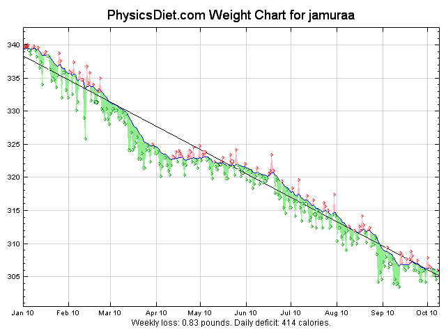
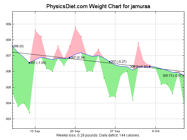
PhysicsDiet.com is working again, which is great news, because I don’t need to figure out another way to get these graphs.  This graph really is what amplifies my frustration.  The loss of less than a quarter pound a week is about a fourth of the weight loss that I’m hoping for.  There is a lot of red meaning I was over my trend weight, essentially gaining points on those days. Strings of three above the line are not what I am aiming for.  At least the linear trend line is still going in a downward direction.

This graph is my savior.  It shows that even after a significant plateau, I can continue on the exercise and make progress again.  You might notice that April looks disturbingly similar to September.  In fact now that I am looking for it, you can see somewhat similar trends right before April and right before September as well.  It’s promising.

There are a bunch of breaks in October, including a trip to Portland where I wasn’t exercising or tracking my weight, and probably some time around that.  The next post in this series will only be in about a week though, since this one is so late.

September Diet Update

My slow decline into a smaller me is continuing nicely.  I’ve been exercising five times a week, skipping usually thursdays and sundays.   Sundays are nice because I can spend more time with Diana on the weekend, and Thursday is good because of the free tourney I run online every week.  I don’t know how I would exercise otherwise.   Because it’s the summer, I’m taking more time outside lately, which is improving my morale, even if I do end up taking the same route every day there is enough variation just because it’s a living, breathing environment than otherwise.  I still end up doing at least a couple days a week inside though - some days it’s just too late to walk outside, and I’m just not that comfortable with the neighborhood even though it is a very low crime area.   Usually when I am inside I am walking on the treadmill so it is basically the same exercise though.  I have been thinking of splitting inside workouts between a couple of the machines lately - 30 minutes walking on the treadmill and 30 minutes on the crosstrainer, etc.   I used to do the crosstrainer regularly and was fairly proud of it because it seems like it kills a lot of people but I seem to have the endurance to just tough it out.

I’m still having issues with sweating a lot.  Doing the walks outside has helped a bit, because it evaporates some more than when I’m on the treadmill.   I still have to hang my shirts before putting them in the hamper, lest the sweat infect the other clothes with it’s smellyness and wetness.   I was hoping that when I got into the exercise routine that something would change in order to reduce the sweating but it hasn’t happened.  I have a sweatband, but I forget to wear it a lot and the sweat gets in my eyes.

What I do to keep me entertained has shifted a little bit.  Originally in my workouts I was listening to podcasts, and then I shifted to watching anime on the flat screens in the exercise room, and from there I ended up alternating between watching TV on my phone and listening to podcasts again.   Then I got into reading and started listening to audiobooks, which I have been enjoying a lot lately.  In the last two months, I ended up listening through all of the Dresden Files, from the first to the latest book, and now I am most of the way through Daemon.  Audiobooks have a lot of advantages, it’s pretty easy to follow along with the fiction books and I can also continue listening to them on my commute if I want to.   I joined Audible briefly but decided it wasn’t worth the money when I could just get these books from the library.

On to the charts:

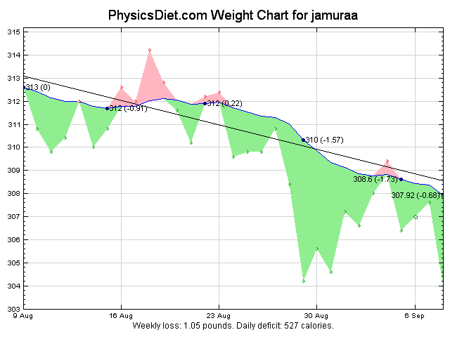
The monthly chart shows my progress getting a little better this month, although the weekly loss is still at a single pound per week.  I’d like to work on that so that I can get it up to two pounds a week which is a little faster and will get me to my goal quicker.  I’ve been trying harder to stick to a pretty low calorie diet lately, which has been working as you can see quite well at the end of the month. I’m getting pretty close to my original goal of being under three bills, so I will have to set myself a new goal soon in order to keep me on this path.

I also have been having a problem ignoring the daily weigh-ins, being sad when I am for example suddenly three or four pounds heavier when I weigh in.  It has an interesting effect on my mood, keeping me vigilant of my diet - that could be a good or a bad thing though.  I’ve been trying to keep my progress on a website called Dailymile as well, but lately I have not been adding my workouts there, because I don’t seem to have anyone that I know in real life, and also the people who are on there seem to be more of a fitness crowd instead of a weight loss crowd.

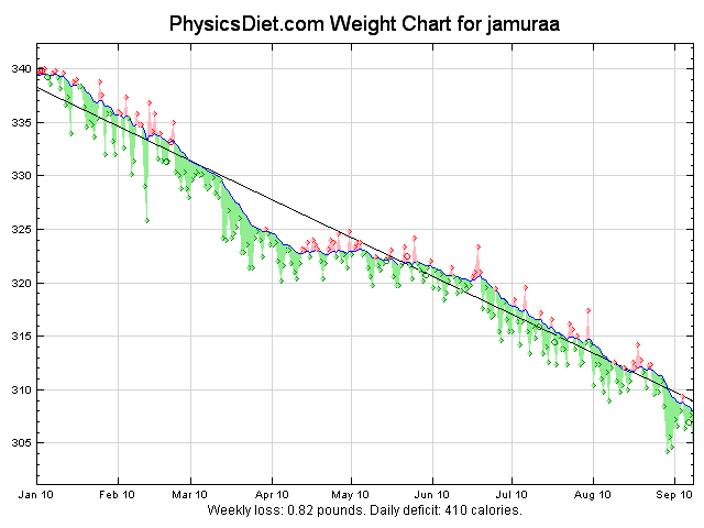
This is the graph that makes me want to keep going.  Seeing the weight just go down, down, down is really strengthening. I just need to keep going and soon enough I will be a much healthier and smaller person.

Magical, Revolutionary, Evolutionary, Upgrade

Lately I’ve been thinking about getting a new smartphone, so I went to survey the landscape.  I’m keeping track of the Android phones and of course it’s impossible to ignore the iPhone 4 as a contender in the Arena.   Apparently the difference between holding these phones in your hand and seeing them on a video is considerable, so I decided to take a look when I had some time to kill at a local mall which has both Apple and T-Mobile stores.   I had already decided to look at the iPhone 4 because it has the retina display which is far and above better than everything else.   The other phone I went out of my way to get 3-5 real-world minutes with was the Samsung Galaxy S series, specifically in this case the T-Mobile Samsung Vibrant.

Let me give some perspective on the whole “review” angle here, because I think that a history with smartphones and phones in general might tint the experience a bit.  I was late to the cellphone game by my normal early-adopter standards, getting one when I first moved to the Twin Cities in 2002.   My first cellphone was a Nokia brick which I could basically run a truck over and have no trouble with.   After a few years, I was getting a bit more advanced, I got a Samsung SGH-509 which was my first camera phone.  It was super thin which I was happy about.. people were commenting on the thinness of it a decent amount.   I think I had another phone in between but it was just a basic flip phone from AT&T.  I went from my super thin phone to a G1 when it came around, my first jump into the smartphone area.  That was 2 years ago (actually a little bit longer now) and now I am up for a renewal of my contract, which means some serious subsidies on a phone.

I picked up the iPhone first, and it was immediately awkward in my hand.   It felt about as thin as my SGH was, which is pretty damn thin.  I know it isn’t because the specs don’t match up, but the G1 is a weighty phone in your hand, you really cup it.   I have also been told I have reasonably sized hands, so maybe bigger phones are just for me.  The other thing I noticed was that it was all glassy.   I usually don’t like glassy, because I do tend to drop my phone about once a week.   My G1 has held up admirably to the drops, landing mostly on it’s back but sometimes on the screen.   I’ve seen some horror pictures of the glass on the new iPhone breaking but wanted to hold judgement.  It may hold up to more abuse than it feels.    I took a look at the screen, and it might just be because I am nearsighted, but I didn’t really see an immediate difference from the G1 that I am currently using.  I went to the browser and zoomed in a bit just to see a smooth curve or something.. then I zoomed out and I kindof saw what people were talking about with the higher resolution, but it wasn’t immediately like “wow this will make my life better”.    I’m also a guy who likes to code with Profont 9pt on a 1600x1200 or better screen, with coworkers regularly coming by and asking how I can even read the code that I’m writing, so it’s not like I don’t like me some high density display.  It just wasn’t something that I was going to drop $200 on.  On top of these, though, I can’t seriously consider the iPhone 4.  It’s not because of AT&T (which is atrocious here) or because I’m an Android fan, but because if I’m going to buy an phone that’s practically a computer, I want to be able to program stuff for it, and the last Apple computer in my house got sold a month ago when it broke down.

So I walked around the corner (no really, the stores are about 50 feet apart) and picked up the Samsung Vibrant.  It was much weightier in my hand, but it is still thin.  It wasn’t as much hefty and large in my hand as it was just weird to hold the phone with the crazy security device that they had on it.  I’ll give something to the Apple store, their security straps really don’t get in the way of you checking out the phone.   The iPhones were held down with a small, silver sticker thingy on the back.  All the phones in the T-Mobile store had the old stand-type security devices, meaning that if you want to hold it, you have a 1.5” pipe sticking out the back of the phone.  Not exactly the best way to see if it’s the right size for your hand.  I wasn’t serious enough in my designs to ask a clerk if I could hold one without a security thingy on it.  It still seemed large.  The other thing about this security device thing was that it made it seriously hard to find the hold / on button on the phone.  It’s on the side, in a not so bad place actually because you could activate it with one hand and still be able to swipe your pattern in, but it was almost covered by the security thingy.

Enough complaining about the phone display quality. The Vibrant itself was quite snappy.   Faster than my G1 by far, and the screen was bigger, but it doesn’t seem to be the same increase in resolution as size.  I browsed to some of the same sites on the Android browser and did the multitouch zoom to the same curve as the iPhone 4, and it looked just as curvy as I had seen just minutes prior.  The Vibrant display was more… well.. vibrant as well, it seemed like the colors were brighter and the backlight a bit brighter.  It wasn’t any easier to read, mind you, just brighter.  I’d probably turn it down in real life to save battery.   It looked a lot like an iPhone 3, with a curved back and a nice big screen covering everything.  It’s a good style, and I like it possibly more than the iPhone 4’s solid lines and such because it makes it easier to cup it in the hand.   There was one big turnoff for me about the Vibrant though, and it was the useless tinkering that Samsung did with the launcher / home screen thing.  It wasn’t overbearing or anything but it was obviously different.   The most jarring was the browser, which had a new “home screen” which I wasn’t pleased with, and the browser was renamed “Web” which I have nitpicks about.  Anyway it was a good phone, but it was also above $100 (there’s a deal for $150 that I know about) and I wasn’t ready to drop that kind of cash for what amounted to an upgrade.

That’s the deal with these phones now.  The jump for me from a Nokia brick phone in 2002, to a flip phone in 2004, to a cameraphone in 2006 were just small steps in cell phones for me.  Each phone had just a small difference that was completely approachable compared to the previous one.  This one is easier to carry.  This one has a camera.  This one is thinner.   They were all basically the same device though, a phone.    The switch from a cameraphone to the G1 was such a change in how I conduct daily life it isn’t even comparable.  It was a revolutionary change in my computing style.  I carry a single device that handles my email, music, reading, todo lists, and on-the-go browsing.   It’s a small computer, and that’s the problem with the new phones I was looking at.  It’s just an upgrade from what I have already.   Switching to an iPhone 4 now is not going to change my life again, even if it has a screen with 300 dpi.   Switching to a Vibrant now isn’t going to change my life again, even if it is two times as fast.  Those changes are evolutionary, not revolutionary.  An upgrade is much less appealing.

Eventually my G1 will stop being upgradeable.  (I’m currently running the 2.2 software on it, and it’s pretty snappy)  Or maybe I’ll drop it and it will actually be broken one of these days.  Then I’ll buy a new phone.  Until then, I’ll continue having a great experience with a truly revolutionary phone, at least for me.

Losing Some Pounds

I’ve been classified as “overweight” for most of my adult life, and people who follow my blogs very closely may remember that I was on a diet for a while called the Hacker’s Diet, using a running average.  The diet focused on caloric intake, trying to figure out your basal metabolism based on counting calories and weighing yourself daily, using a running average to determine the calorie surplus or deficit, so you could make decisions to change your intake accordingly.

I had an issue with the program, because I like to go out to eat with my lovely wife fairly frequently.  This means that I am constantly trying to calculate the calories in meals, constantly overestimating or underestimating. Fast food is generally okay, because as a company gets larger in size more people will start asking for the nutritional facts. Of course marriage actually adds a lot more problems with the scheme because Diana likes to cook (and she cooks delicious meals), and those also don’t usually come with calorie content.

It wasn’t working out, so I ended up basically quitting after a while, because of the frustration with both the calorie counting, and I didn’t have an accurate scale.  A scale that you can depend on across the weighings is very important.  Luckily I fixed the second part of the equation.  I still haven’t figured out how to fix the first part, so I ended up giving up and modifying the diet.

My current plan is reliant on the weighing system, but doesn’t deal with the calorie counting.  So I weigh myself every day, and keep track of the average just like on the original diet.  Additionally, I’m adding an exercise component, in order to burn more calories off and make sure that I am calorie negative.  Of course, exercise has other benefits beyond just burning calories.  Getting out of the house and walking around helps me with listening to the podcasts that I want to, as well as some audiobooks.

I started the exercise at the beginning of the year, exercising on the treadmill and on the crosstrainer in the newly installed exercise room in the apartment complex.  My normal schedule was an hour five days a week, with a break day Thursdays and Sundays.  That was great and helped with my determination by having the days off. Everything was working for a while, but I think I started unconsciously eating more calories, compensating for the exercise, and I started to see stagnation.  To give my diet a kick, I started watching my intake as well, and that seemed to have the intended effect.

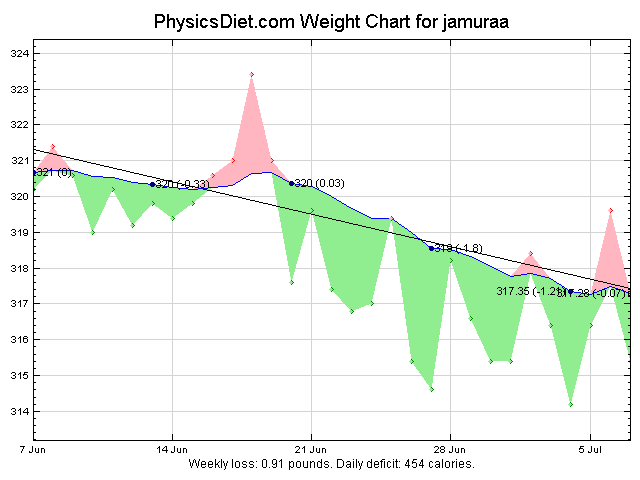
From the last month:

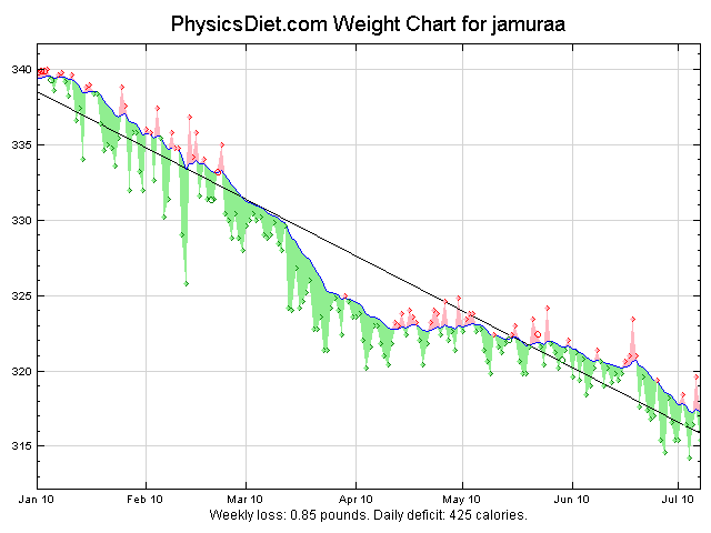
So just like the last time, I am using the tracking tools on physicsdiet.com to generate pretty graphs and give me the trend lines. Actually, I’m keeping track of my weight daily in a Field Notes memo book that I got on special and which is about the perfect size to keep right next to the scale, and then I transcribe them to the website about once a month. You can see here the time where I was stagnating at the beginning of June, and when I started watching my intake where the trend line starts going down more smoothly.

Entirety of the diet:

Here the stagnation is a lot more apparent. I was still making progress, but it was much slower from mid-April to the start of June.  Overall though I like this rate of weight loss.  One pound a week is what most people would call sustainable weight loss.  My short-term goal is to be below 300 pounds, which looks like it will occur this year. I don’t know what the long term goal is yet.  I’m hoping to make a post about once a month, if only to keep myself reevaluating myself.

Cullect.com: Part 2 - Skitzophrenia

I recently praised Cullect.com for being a pioneer in the feed reader arena.  The Importance metric made sure that you were reading things that were interesting to read.  It all but eliminated the ‘tl;dr’ syndrome for me.  Unfortunately, it was not always rainbows and lollipops with Cullect.

Cullect was very focused around sharing your list.  It had a number of options for sharing to services like twitter, del.icio.us, facebook, whatever you could think of.  That is fine for sharing individual items, but the real gain would come from sharing a whole list.  You see the importance rank can work for you: it will make the best items from all time come to the top.  In this way, you put Cullect to work as a curation tool, hiding things that are irrelevant, and recommending items that you would like more of.  As a bonus, you can have multiple people who are curating a list, recommending and hiding items as they see fit.

Now we get to the skitzophrenia though, because a list couldn’t serve two purposes at once.  If you have a reading list, you would hide items as soon as you had read them, because you’ve already seen the information.  Even if it’s the most important item tomorrow, you won’t want to read it again.  If you’re curating a list however, you never want to hide the most important items, making it a pain to skip past the ones that you’ve read every time.  Even on the most active topics, the most important items are static for hours or days.   If I’m curating a list, I always switch to the latest feed, so that I can look at the newest items and bump them up by recommending them if they are good.  Multiple curators make this an issue though, because my fellow curators may hide items that I could recommend.

You have two tools: a great reader that you can just sit down at and read for 10 minutes and know you’re reading new, interesting, “important” things, and a excellent tool for showing the best content in a particular area.  You can’t have your cake and eat it too though, which might be a feature that could push it over the top.   You can fix this by splitting the “read” and “hidden” flags in the database, so that curators can choose between the “important and not read” view and the “important all time” view.  You might even extend the concept to allow a user to decide how to time-limit the importance view.  This type of time-limiting is a powerful tool - you could build feeds that only show a single item from each day (or week.. or month), just the one that is most important.

This “concept problem” has been bouncing around in my head for a while now, but it’s still not fully formed for some weird reason.  It could indicate that I’m just not seeing the forest for the trees, or that I’m getting a little too hazy on the problem because there is so much which was done right with Cullect.

Next, I’ll talk about a feature that I’ve been wanting for a while in any reader, that seems like a slam dunk for Cullect.

Cullect.com: Part 1 - Importance (and Google’s Magic)

This is a series of posts that I’ve been meaning to write about the site Cullect.com, which is currently on “extended hiatus”.  For those of you that don’t know about cullect, it was an interesting beast of a website developed by Garrick Van Buren, a local developer.  It was plagued by downtime near the end of it’s life, and I think it was right to take it down for a while and work on it.  Garrick may have abandoned it for now, but I’d like to explain some of it’s features, because they are innovations which I wish I would see more of the aggregators take a look at.   It was one of the few feed readers out there which had some real innovation under it’s hood, and I was thrilled to be using it.

The first of these features, and the one which was most visible and that I want the most, was the way that it made reading a lot of feeds a trivial task.  This was because it included a recommendation system that would rank the stories that you hadn’t hidden (which is somewhat, but not exactly analagous to “read”, a topic I’ll take on in a later post).   It used the fact that you liked some feeds better than others to put those at the top.  I don’t know the whole algorithm, but there was a hidden social aspect as well - if some other people “recommended” the story, then it would get more importance.   This was brilliant, because you could spend ANY amount of time looking through your feeds, sorted by importance, and be sure that you weren’t missing the big story of the day.   When you got bored with the stories, you would just leave, knowing that you wouldn’t be missing anything that was more important.

Some other aggregators would like you to think that they have something similar, sorting by something like times recommended, or amount of comments, or votes, but they are not the same.  Importance score was tailored to each post, and to each Cullection (a set of feeds).   This made it personalized to you, and presented the things that YOU wanted the most.   Unfortunately, I think that one of the reasons Cullect ended up shutting down was because recalculating all of the importance scores was very CPU consuming, and it was taking too many resources.

Since the takedown of Cullect, I’ve been using Google reader as a passable replacement.  Recently (as in, like the last year?) they added a bunch of new features, including “liking” a story, sharing stories with friends (another thing which Cullect excelled at), and “Sort by magic”.  It’s not exactly the same as sorting by Importance I am sure, but it is the most likely the closest thing out there.   It seems to have a little more in common with the “popularity” indices that other aggregators are using, but I was happy to see something at lease somewhat similar show up in the reader that I ended up using as a replacement.    Still, I hope that Cullect can come back in some form in the future, as it was hands down the best reader that I had ever used.  That’s not to say that there weren’t problems with the site, though.  I’ll cover some of it’s disconnects in part 2.

Garrick is still making cool new properties.  I’m using kernest on this site to get fonts that I like out to every modern browser with little effort.

Random Thoughts on the iPad

If there is one thing that has caused quite the stir, it’s the announcement of the iPad last Wednesday. Everyone seems to have an opinion, and of course I have mine as well.  Apple fans are saying that it will change the paradigm of computing, including splitting people into two worlds.  There are of course a lot of grey areas here.  People are tying major issues to the lack of flash, which isn’t really a big deal if you ask me.  Eventually Flash was bound to fall, because it’s a closed system at it’s core.  You can make some Flash things without Adobe, but they can always change the game on you.  Of course, the Apple App store is just as closed as Flash.  You can’t put anything on the iPad without the magic bits from Apple saying that it’s kosher.  There are already a bunch of invalid reasons that they have for rejecting apps, including the very anti-competitive practices of rejecting anything which will be competing against their own apps.  Will they reject word processors for the iPad which compete with iWork?  How close does something need to be in order to be rejected - will OmniGraffle’s outline making tools be too close?

Because I love the iPad, it’s such a great piece of tech.   I can even buy into the “new world” of non-multitasking (noone really multitasks anyway) and non-filesystem world.  I can see building apps for it, but I don’t want to work in the closed system which is the Apple universe, where everything is gatekeepered by a process which has been opaque at best.  It’s all of the arguments against the iPhone’s development model, except on a larger scale.  There were companies who wanted to develop software for the iPhone that were niche apps - things like warehouse inventory systems.  The iPad is larger, it’s about the perfect size to walk around with and read stuff off of.  10 hours of battery life means it lasts through the whole workday.

Of course, there is a back door into most of the new apps - the web browser.  The best part of this may be that you can use it perfectly as a portal to a web app that can build you anything you need. Apple may be getting what they wanted at the start for the iPhone with the iPad.  We all remember the few months before there was an SDK when the party line was that you could do everything with web apps?  It’s much more likely with a nine inch screen and a blazing fast browsing experience.  Web apps are also the end-around of all the restrictions that Apple places on their “approved” apps.  You want a picture of an iPhone in there?  It’s just a GIF.  Want to put some “adult” content in?  HTML5 video to the rescue!  The only thing you can’t do is background processing, but you can’t even do that with real apps.  There’s no API bugs to work around.  It’s not exactly the same as a real app for low-latency things like gaming.

At any rate, I’m still going to develop web apps, and I think that the iPad will be the kick in the pants that the industry needs to make a decent tablet.  Android phones are getting better, and accelerating, in large part because the iPhone changed the smartphone ecology forever.  If the iPad does the same to the tablet market, it will be a very exciting future.

Kauai - Day 1

Well, we have finally tied the knot, and now we are on our honeymoon. It feels great to be here at all. The first day was of course mostly taken up by flying from place to place, on our way here, and then taking the hour long drive to the condo. I’m going to call that Day 0 because it doesn’t really involve anything other than travelling. We checked out the internet (cable modem, not bad) and went to sleep after finding some groceries which were quite expensive. After a pleasant sleep in the condo, we were happy to wake up to a beautiful view:

The ocean extended out into the horizon, and we sat on the patio (lanai) to eat breakfast which today was cereal with milk. It is quite relaxing and especially knowing that I didn’t have anything really planned for the day. We decided to make this a little excursion day, finding the nearest large-ish town and looking around. We drove down to Hanalei which is the nearest town of any size. The road down is pretty steep and includes a one-lane bridge, saying something about how many people are around here often. It is obviously one of the less-populated islands. Hanalei itself is a fairly small town which borders a very large beach. I would estimate that it is about the same size as Pella, Iowa.. maybe a little larger. It’s hard to gauge because it is very spread out along the beach. We stopped for some lunch and looked around the shops for a while. Then I bought some sunglasses because I lose every pair that I own after a max of a week.

Afterwards we decided to explore the small condo complex that we are staying in. The pool was found, and is open from 7am-7pm. The hours are a little strange, but it is not lighted, so I guess it is better for the night to be swim-less and also accident-less. I had heard about Sealodge Beach that is near the complex, accessible by trail and wanted to go down there. The trail was marked with a sign saying that it was steep, slippery, and dangerous. Thinking it was only to ward off liability, we started down the trail, which was immediately quite steep. There was then a little creek and then a steep hill that we went both up and down the other side. It was really like hiking through the jungle. The path was quite beaten though so it was well-travelled at least. After the hill we came to the ocean, where the coast is covered with huge porous lava rocks. At this point we either took the wrong way, or the trail got a lot more treacherous. It was very narrow and right along the dropoff which was rocky. People with little hiking skill shouldn’t really take the course. I didn’t realize until later how scary it was for Diana, and now I wish we hadn’t gone farther than the first view of the ocean which was spectacular and much less scary. When we finally could see the beach, we found our way to the end of the trail which was a quite large drop (>4 feet) before the beach was accessible. I think we either didn’t see the right path, or we were supposed to take some other way down the rocks. In any case, we didn’t have the right footwear for this hike - we were both wearing our sandals at the time. I think that Di got some good pictures of the hike before it got to the scary part. We went back to the scenic look of the ocean and relaxed a while, and then again back to the condo from there with some rests. We warned a couple off the trail who was also wearing sandals on the way down, and told another of how it got much harder down the way. I also lost my newly-purchased sunglasses somewhere on the way back up, setting a new record of about 2 hours from buy to lose. I’ll need to buy another pair. I’m still thinking of trying to make it there again. Knowing the way makes it a bit less scary, because you know that you can get there. I don’t think I can convince Diana to let me head down there though, she was very scared for our safety near the rocks.

After the hike to the beach, we relaxed for a little while and then decided to head for some dinner. We drove again to Hanalei and spotted a pizza place called Tiki Man Pizza. The wait was a bit long, there were apparently some large orders (the man mentioned something like 8 pizzas for one group) but it was worth it. We had a pork pizza with pineapple and extra cheese. It was some of the best pizza I’ve had in a long time. The sauce had just a little sweet barbeque in it, which gave it a nice taste. There was music at the bar next door as well, but it took a turn for the “frat boy” as Di put it, so we decided to go to another place for dessert and drinks. We ended up heading to Bar Acuda which had an interesting atmosphere which seemed a bit more high-class. We had some cocktails and wine and a nice dessert chocolate ice cream.

It being about 2am our time at this point, we headed back to the condo. It started to sprinkle a little bit and we walked out on the lawn to see the Kilauea Lighthouse flashing it’s warning to boats (although we have seen exactly zero boats in the water off the coast so far). The rain didn’t come in the condo so we just left the windows open even though it could get a bit cold at night as we found out our first night. Anyway that was Day 1. We’re headed to the lighthouse again today I think, and maybe to the beach to try some snorkeling and swimming, and relaxing.

Check out Diana’s Post for Day 1

Big Bang Theory Intro #4: Lava Erupting

Today we come upon our first picture in the montage which doesn’t have a lifeform in it. It’s lava! Dynamic! BOOM! Eruption!

This particular image is kindof hard to make out in the black and white which it was modified into to make it look old. The original is a little easier to see the actual lava which is flowing from an eruption happening in the center to another pool of lava rock.

There are four different types of lava, which are based on the chemical composition of the lava itself, but that correlates with the temperature. It is of course, extremely hot, with the coolest form of lava being at least 1000 degrees Fahrenheit. A lot of the lava which is in the US is in Hawaii - it would be nifty to see some of it, but hopefully not the quick flowing kind. We’re heading there on our honeymoon later this year, so it’s a possibility. One of the things that has always fascinated me is Pillow lava, which is when lava is extruded under water and instantly cools and solidifies partially. It also looks really cool. I found out that it is also used as a way-up criterion because of the way it is formed with the ridges normally on the top.